


Before we jump into axes lets first understand flexbox and how it works
flexbox
Flexible is a one-dimensional layout model, that deals with the layout in one dimension at a time — either as a row or as a column. -MDN
Flex container and the display property
In order to use Flexbox, you need an element that will be the flex container in your HTML and display property that is set to flex In your CSS.
Example
here we used The flex-direction property to set the flex items in the flex container to row.
Note: by default the flex direction is row.
now lets get into Axes :)
The Two Axes Of Flexbox
when working with flexbox you need to think in terms of two axes — the main axis and the cross axis.
main axis and cross axis with - direction row
main axis
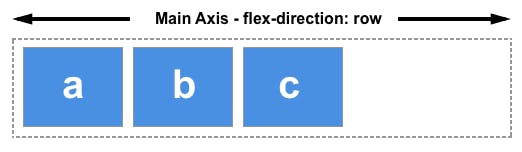
If we set flex-direction to row or row-reverse, your main axis will run along the row
cross axis
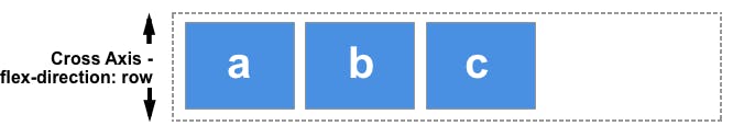
if we choose to set it to row or row-reverse the cross axis runs down the columns
main axis and cross axis with- direction column
main axis
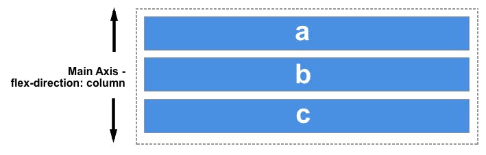
With flex-direction: column, the main axis is down the column
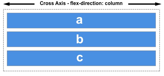
cross axis
With flex-direction: column your cross axis runs along the rows.
Conclusion :
Axes can be confusing but I hope this article helped you understand at least 5% of it
thanks for reading and have a great day/night ❤️